One of our first opportunities to impress and persuade potential customers is with our logo. As the identity of our business, our logo is tasked with the important job of making the first impression. As business owners, we want that impression to be a positive one.
The importance of a well-defined icon, paired with an appropriate font, executed in an appealing color palette will properly reflect and elevate your brandʼs value. Awareness of the seven design principles of a great logo can help you evaluate whether your logo is effective at representing your business, product, or service?
7 Design principles of a great logo
- Functionality
- Legibility
- Visibility
- Iconic
- Relevancy
- Simplicity
- Adaptability
Principle
1
Functional
Does Your Logo Serve its Function?
A logo’s function is to be recognized and remembered by your customers. Perception is key. As the face of your business, a professionally designed logo can immediately communicate to your customers vital details about you and your business:*
- What you do
- What your values are
- Your business’ status or culture
- Trustworthiness and credibility
Q.1
Does your company’s logo and identity matter to your customer?
A polished and professional logo gives legitimacy to your business and is a powerful communication tool. People are more likely to purchase from a business that appears trustworthy. Poor logo and identity design have the power to harm how your business is perceived.
Most mass-market brands have logos that are meaningless shapes or letters. They also spend $100 k if not millions of dollars in advertising and marketing building brand awareness: recognizing and connecting their logo with their product. If you currently don’t have that marketing budget, consider utilizing your logo as a way to communicate who you are and what you do.
Principle
2
Legibility
Is Your Logo Easy to Read?
The sole purpose of a logo is to be easily recognized and remembered. Logos that are difficult to decipher are better forgotten. If your logo isn’t legible or is too complex, it will negatively impact your perceived credibility and reputation.
Illegible logos commonly use:
- Script or frilly fonts with overlapping letterforms
- Letters spaced too far apart (kerning)*
- Letters that are too condensed
- Bitmapped or logos with low resolution
- Clashing colors: competing color values

Designers often kern out words (add space between letters) to fill up space, which impedes legibility. Kerning pushes the letters too far apart, causing each letter to look like an individual graphic instead of one word.
Priinciple
3
Visibility
Is Your Logo Visible?
Where is your logo being placed? Too much or not enough contrast between the elements of your logo and their background negatively impact visibility. Is your company’s logo positioned in a way that helps or harms its visibility?
Common logo visibility issues:
- Placing a light colored logo on a light colored surface
- Placing a logo on a busy background
- Lack of Breathing Room – Cramming content around a logo
Principle
4
Iconic
Is Your Logo Iconic?
Your logo is an opportunity to communicate what you do graphically. Iconography isn’t necessary, but an icon is the most powerful element for communicating an idea quickly. Putting a name in a font and calling it a logo is a missed opportunity to inform and communicate.


Principle
5
Relevancy
Is Your Logo Relevant to Your Target Market?
A successful logo’s ability to communicate with the use of a word or mark is most impactful when it’s relevant to its audience. Tapping into your customers’ preferences and demonstrating your understanding of those preferences through style, font, and color choice makes your logo relevant. Relevancy is powerful as it inspires resonance, builds trust, and creates loyalty.
Principle
6
Simplicity
Is your logo design simple?
A logo is a singular brand identifier. Assisted by typography and iconography, a good logo can be highly conceptual however, it should be symbolic, not a literal depiction of what you do. The Amazon logo uses a single word with an arrow symbolizing “from a to z ” even with its complicated business model. In other words, a very complex concept is communicated simply.*

Principle
7
Adaptibilty
Is your logo design adaptable or responsive?
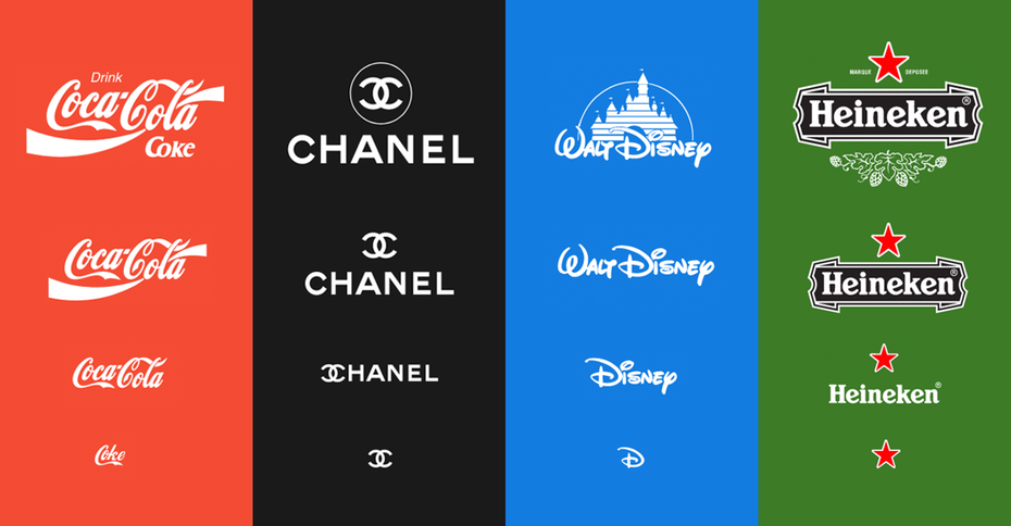
More important than ever is the adaptability of your logo. Where will it be seen? Printed on boxes or displayed on YouTube? A good logo design should be suitable for mobile and web, digital and print, for every scale and shape.

Can your logo stand the test of time or is your logo based on the latest trend? Adaptive can also imply timelessness, which is important but not essential in a modern and quickly evolving marketplace.
Is your small business website working for your clients?
“The care demonstrated in our online presence equals the perceived value of our product or service.”
Are You Confident In Your Brand?
We've compiled a checklist of 10 must-haves every brand needs to make a meaningful impact.
10 Branding Principles